![]()


McLaren Farming
“Glenmore”
Barmedman
N.S.W. 2668
Ph: (02) 69762045
Fax: (02)69762225
mclfarm@intemora.net.au
After collecting yield data for four years a system needed to be developed to view all the data in a single map. This has been achieved by placing yield data on a grid using kriging, normalising each years data and then creating average node values which are then mapped. The resulting zones are soil tested, assigned a yield potential, and or ameliorated if possible. Application decisions are made with the aim of maximising returns from inputs.
EM data has been used extensively in the operation to determine soil type boundaries within areas with similar management histories. These maps have then been used to target soil testing for pH and sodicity and then used to develop lime and gypsum application maps with the aim of increasing pH, addressing soil structural problems and supplying sulphur in the most efficient way possible.
Introduction
In 1996 when we began collecting yield data we were excited. For the first time we were going to be able to determine objectively which areas of our paddocks were producing and which areas were not. The resulting maps generated long round the table discussions. In the second year we expected to see common areas of low and high yield. There were in fact very few. Even if there were, flicking between two maps on the computer screen did not prove a very successful way for comparing Yield Maps over time.
In1998 “Case Corporation” approached us to trial their variable rate “Concord Air Seeder”. Suddenly it became imperative to answer the following question.
How do you turn yield maps, with both spatial and temporal variation, into a single map to use as a template in developing a rate maps?
The answer was not immediately apparent. Most people in my sphere were battling with the hardware and had not even considered analysis.
I attended the second PA symposium in 1998 and was impressed by Dr Brett Whelan’s handling of yield data in the statistical software package “Jump”.Dr Whelan’s work provided a starting point.
Map Creation
Creating MAP Application Maps From Yield Data
To convert Yield Maps into Phosphate application maps a twelve stage process is employed, involving five different software packages. The steps are as follows:
1) The yield data is examined in “Instant Yield Map” Case Corporations package software. This is to check the data to determine if the GPS signal has not been lost or damaged. Static electricity, power surges, operator errors, hardware and software errors are all working against the mapper. If there is damage, a decision must be made as to whether there is sufficient material to work with. Data from different headers is combined at this stage.

1: Paddock “S” wheat crop in 2000 point data as seen in “Instant Yield Map”.
Figure 1 shows point data in “Instant Yield Map” for paddock “S”. The data shown is a wheat paddock harvested in 2000.
2)Export Map from “Instant Yield Map” as a comma delimited text file.
3) Import the text file into a Statistical Package. A histogram is generated (Figure 2) and any outliers removed. The data is checked for normality and header means are matched. Figure 3 is a histogram of the cleaned data. The cleaned data is re-saved as a text file.
|
|
1: Histogram of raw yield data. |
2: Histogram of yield data with outliers removed and header means adjusted. |


4) The data is then used to create a variogram in “Surfer” a grid based graphics program. Figure 4 shows the variogram and model for the year 2000 yield data. Most yield data models are based on power functions.

4: Variogram and model of year 2000 yield data from paddock “S”.
5) Kriging is then carried out using the model generated in the previous step. There are five other gridding methods available in “Surfer”, Nearest Neighbour, Natural Neighbour, Inverse Distance and Modified Shepard’s Method. Kriging is used because of its power when working with damaged data.
6) The grid file is blanked and mapped in “Surfer” as done in Figure 5. Blanking gives values in the grid that lie outside the paddock boundaries a constant low value. The grid file is then saved as a txt file.
7) Steps 1-6 are repeated for each years data
8) The gridded data is imported back into the statistical package . Any blanked points are

5: Map of Kriged data in “Surfer”.
removed. The remaining data is combined with yield data from different years. EM and elevation data is added if available. Table 1 shows the file layout in the statistical package.
9) Each column of yield data is divided by the 99.5% quantile to generate an index between 0 and 1. The index values are averaged across time.

Table 1: Table of data is Stat package.

Figure 6: Map of index values in “Instant Survey”.
10) The index average is then saved as a text file in a format that can be imported and mapped in “Instant Survey” as done in Figure 6. Once mapped a drawing layer is overlayed as shown in Figure 7. The drawing layer includes zones and soil sampling points. The soil sampling points for paddock “S” do not fall within the different zones. That is because these soil test points were decided upon before the harvest 2000. There positioning was based on previous yield maps and in particular the EM map of the paddock. The drawing layer is converted to a mif file and downloaded to a hand held PC running “Pocket Survey”.The map is saved as an “Instant Survey” ald file. .
10) In the field samples are taken by driving to the map sample point and then walking around the vehicle, taking approximately thirty cores. These cores are batched and then tested by the “Incitec Lab” in Brisbane. The soil test results for paddock “S” are displayed in Table 2.
11) The index map is imported into the “Instant Application Map” software package supplied with “Case Corporations” Concord Air Seeder. Management zones are redefined using the map and soil test results. Steps are taken to ameliorate soil problems such as acidity, sodicity, magcity and trace element deficiencies. Paddock “S” was uniformly acid so 2.5t/ha of lime was applied.
12) Target yields and corresponding phosphate application rate are then assigned to each zone. Because paddock “S” had high soil phosphate and had just been limed, a maximum rate of 15 units of phosphate ( 75kg MAP) was applied to those areas with the greatest yield potential. Areas with lower yield potential and poor performance had phosphate applied at fractions of the maximum as shown in Figure 8.

Figure 7: Index map with zones and soil testing points.

Figure 8: “S” Rate Map
Table 2: Soil Test results S

Creating Lime and Gypsum Maps from EM data
During the late nineties CSU’s Farrer Centre began offering commercial EM38 surveys at a cost of $2.50/ha. These surveys provided a fast inexpensive way of identifying soil type boundaries. The soil we farm is variable as a result of our position on the Western edge of the Lachlan Fold. Our soil types range from Red Earths, Grey Cracking Clays to Classic Iron Bark soils. It is possible to find all three soil types in a single paddock.
Three soils may require three different lime and gypsum treatments. EM mapping has also been used to identify soil texture differences is visually homogeneous red earth paddocks.
Case Study 1: Paddock “MG”
In 1999 MG had a lucerne clover pasture and was to be bought back into crop in 2000. We regarded it as a sodic, magnesic, hard setting clay paddock, prone to water logging. It had a light rise running through the paddock where the lucerne was not persisting. The light soil was considered the better part of the paddock. because of better crop establishment.
An EM survey was carried out in December 1999 the result of which is shown in Figure 9.
MG has a distinct soil type boundary. After soil testing a prescription was written for this paddock. 2.5 t of lime and 600 kg of gypsum (sulphur source) was applied to the light rise and 2.5 t/ha of gypsum was applied to the heavier portion to the paddock.

Figure 9: EM 38 map of “MG” generated in “Surfer”.
Case Study 2 “H”
Paddock H has uniform topography and soil type being a gently undulating red earth. The soil type is characterised by its low CEC and acidity. This paddock has had a long cropping and legume pasture history. This paddock was limed in the previous cropping cycle at 1.75 t/ha. Generally the paddock still under preformed with a high degree of variation as can by seen in the 1996 canola yield map in Figure 10.
In the pasture phase lucerne did not persist on the light rises and in a section up the middle of the paddock correlating approximately with the low yielding area’s in the 1996 canola crop. An EM map was created as shown in Figure 11. The EM map correlated with the lucerne persistence and the existing yield map with the exception of a North West strip running up the middle of the paddock which has probably been generated by an lime application error.
Surface and Sub Soil tests were carried out at points 2 and 3 and surface soil test were carried out at points 1 and 2 . The surface soil at all the points was moderately acid with very little aluminium. The subsoil however was vastly different between sites 2 and 3. Site 2 where the lucerne had persisted had quite a heathy subsoil (pH 6.1 CaCl2) whereas the pH in the subsoil from sample point three was down to 4.1 in CaCl2 with an Aluminium Saturation of 20%. Subsoil acidity is hard to treat. The pH is the surface soil must be moved above 5.5 (CaCl2)
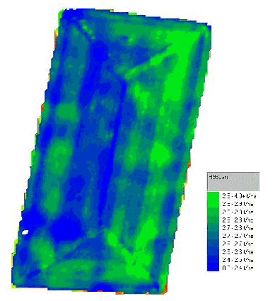
Figure 10: Paddock “H” canola 1996

Figure 11: Paddock “H” EM Map with soil test points.
to get base movement down the profile. Economically only a blanket rate of 2.5t/ha was possible. The zones where the lucerne had persisted only required a maintenance rate of 1 t/ha whereas the areas with acid sub soils would benefit from a high lime rate. Three rates of lime 3.5, 2.5 and 1.5 t/ha were applied as shown in Figure12. The lime was applied in August 2000. While the Phosphorous levels did not vary greatly across the paddock applied Phosphorous was varied across the paddock based on the lime application maps. The areas that received the high rates of lime received 2 units less of Phosphorous. This was because:
a) Even with the high lime rates the target yield will be less given that it will take time for the lime to move down the profile..
b) There will be an increase in available Phosphorous because of the increase in pH.
c) Where we have limed greater phosphate efficiencies are being achieved.
The Phosphorous rate could probably have been varied to a greater extent but much of the science behind these decisions does not exist. While Phosphate application work has been done in the past in NSW, it was carried out for a completely different cropping system. This work needs to be revisited by independent research bodies.
Table 3: Soil test results, Paddock “H”.


Figure 12: Lime Rate Map for paddock H.
Conclusion
Using gridding it is possible to analyse yield maps through time and space and create meaningful application map templates. There is still some distance to run with both software, hardware and analyse.
EM mapping provides a powerful tool in determining soil type boundaries, allowing zone development and targeted soil testing before the cropping cycles begin.
From an economic view point McLaren Farming’s Investment in Precision Ag technologies as repaid us handsomely both through better targeting of resources and higher average yields.
But maybe, the greatest reward, is a more intimate relationship with our land, brought about by the use of Precision Agriculture. For the first time since the mechanisation of agriculture after the industrial revolution, we are acquiring and using tools that allow us to cater for in the field variability.
